When Art Helps Story

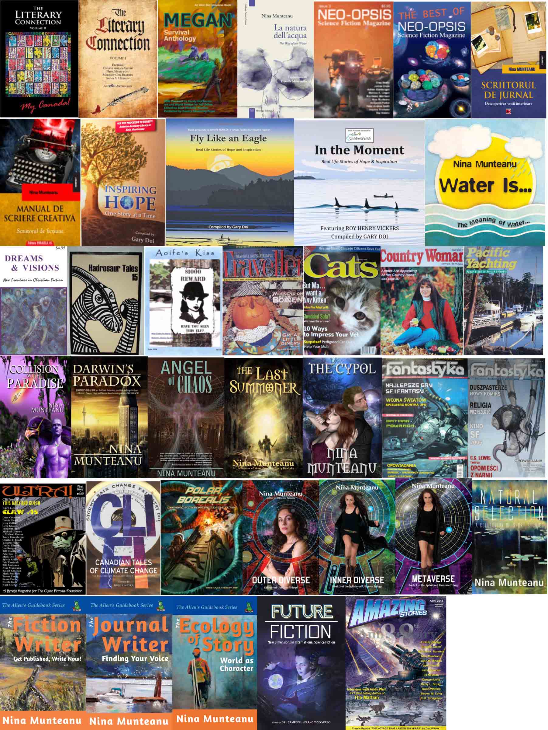
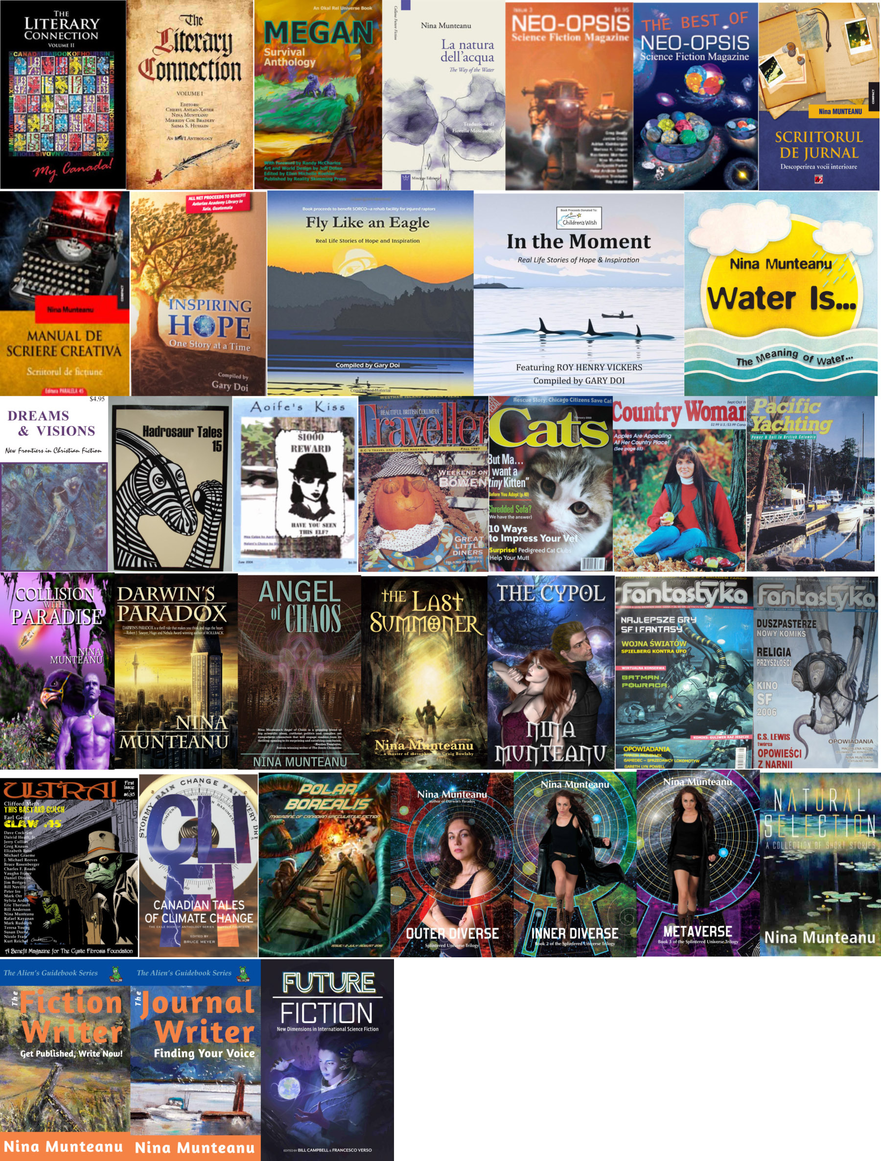
No writer works alone. Sure, we may work alone when writing, but all other aspects of getting our writing out to you, the reader, involves a team of other people. Like all good things, writing is a collaborative affair. All professional writers enter a contract with their publisher to work with editors, marketers, and also with cover artists, designers and interior artists. All together create the final artistic expression shared with the reading audience.

I want to focus on the latter here and celebrate how art and design help create more than what the writer alone produces. When my writing career started in earnest in 1995 with my first publication in a professional magazine, I was involved in collaborations with artists, who all improved my work.

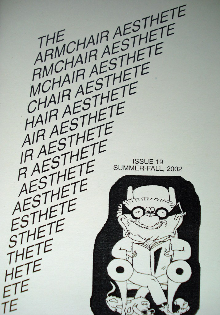
Arc of Time was my first short story publication, appearing in Armchair Aesthete in the Summer/Fall issue of 2002. Armchair Aesthete is a small literary magazine in the United States and features funky cover art.

Magazine cover for Ultra! and interior design for “Arc of Time”

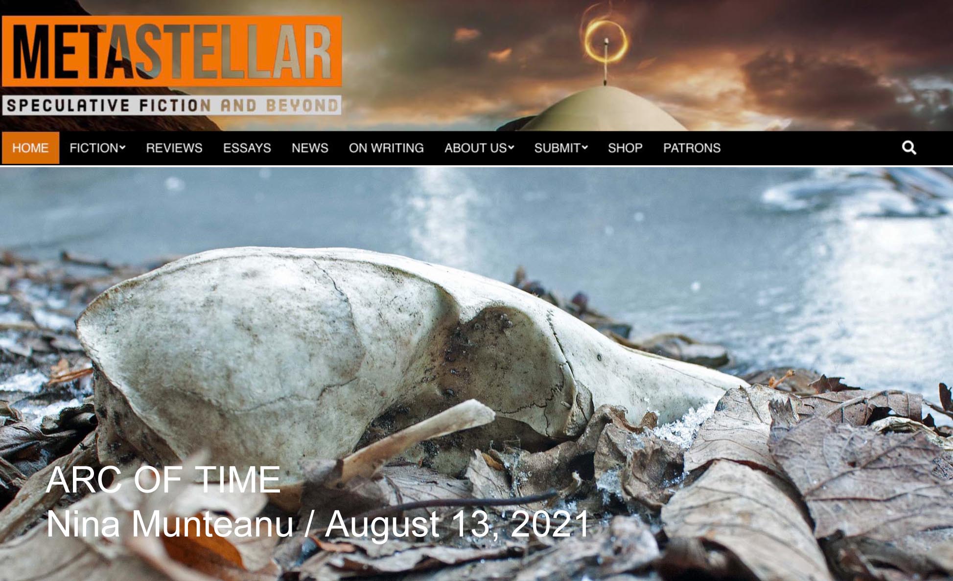
Arc of Time was then accepted in the premiere issue of Ultra! (Aardwolf Publications) in 2004. That issue contained a fully illustrated and designed interior, which really set off the story—an epistemological exchange of emails linked with narrative. In 2013, MetaStellar Speculative Fiction and Beyond, which provides illustrations for each story it carries, used one of my own photographs to illustrate Arc of Time.

Feature cover illustration for “Arc of Time” on MetaStellar site

Virtually Yours first appeared in Hadrosaur Tales in Issue #15 in December 2002. Hadrosaur Tales is a small but vibrant literary magazine out of Las Cruces, New Mexico and featured interesting covers.

Cover and story illustrations in Nowa Fantastyka for “Virtually Yours”

Virtually Yours was republished all over the world and is up to its tenth publication this year. Several publications included artwork specifically for the story. Nowa Fantastyka, out of Poland, is a slick magazine that boasts a lot of images, colour interiors and illustrations. My story was introduced with illustrations that enhanced its impact.

Interior illustrations for “Virtually Yours” in Amazing Stories and MetaStellar, respectively

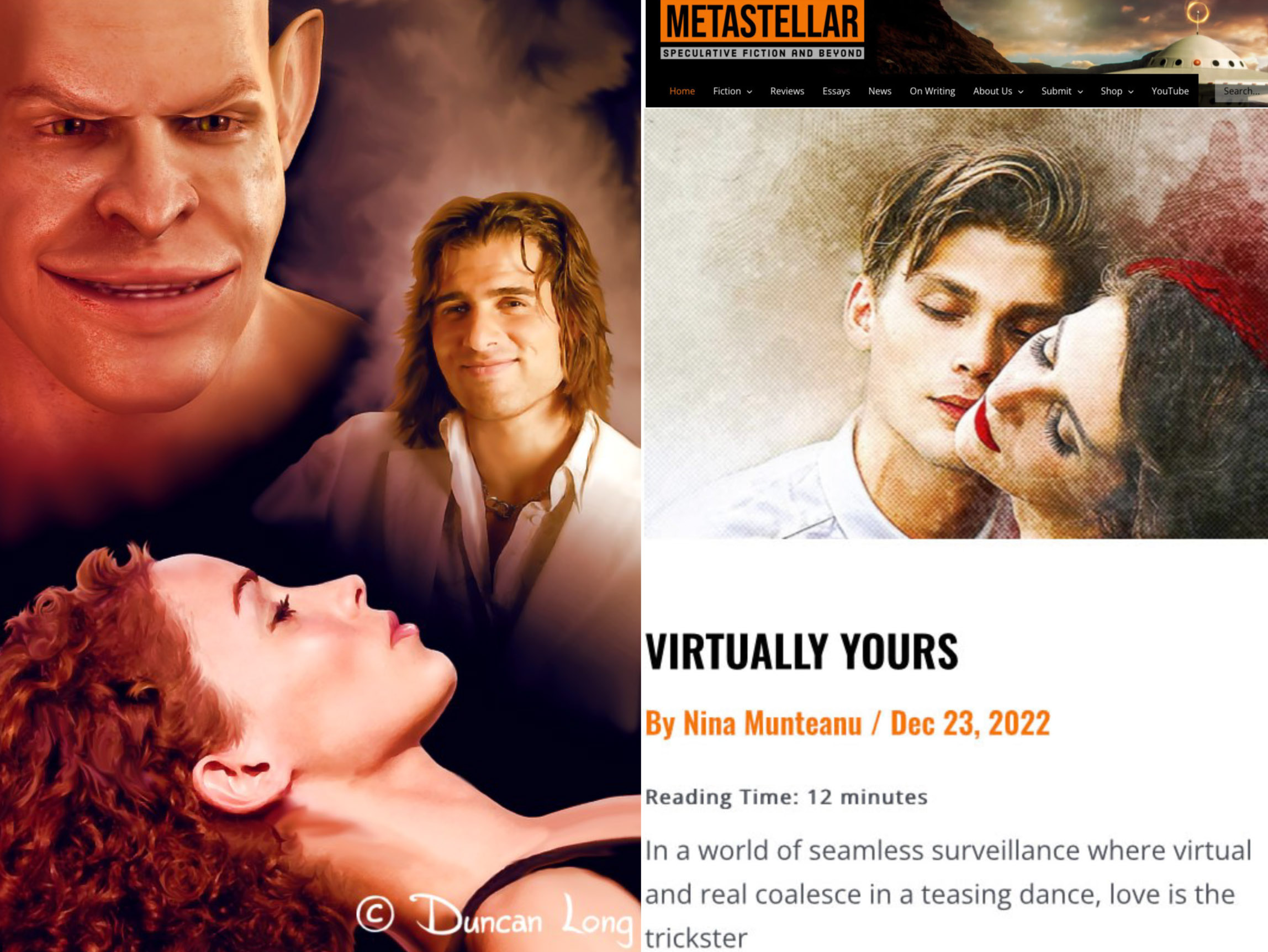
Its reprint in Amazing Stories was illustrated evocatively by Duncan Long. In the story’s later reprint in MetaStellar Speculative Fiction and Beyond, Brigitte Werner created a beautiful illustration for the story.

Nowa Fantastyka cover art and story art for “A Butterfly in Peking”

A Butterfly in Peking first appeared in Issue #17 of Chiaroscuro in 2003. Its reprint in the Polish magazine Nowa Fantastyka in 2005 included interior art that introduced the tone and feel of the story.

Megan Survival Anthology cover art and story art for “Fingal’s Cave”

Fingal’s Cave was first published in The Megan Survival Anthology (Reality Skimming Press) in December 2016. The publication included art by Jeff Doten specific to each story in the anthology and I found his artwork for Fingal’s Cave wonderfully intriguing.

Artwork for “The Way of Water” in various publications

The Way of Water was first published in Future Fiction then in a smart print publication by Mincione Edizioni in Rome, Italy in May 2016. The story was reprinted several times and artwork associated with it included in some of the publications. One is Little Blue Marble, an online magazine that features artwork for each story it runs.

Cover art of Eagle Magazine and story art for “Natural Selection”

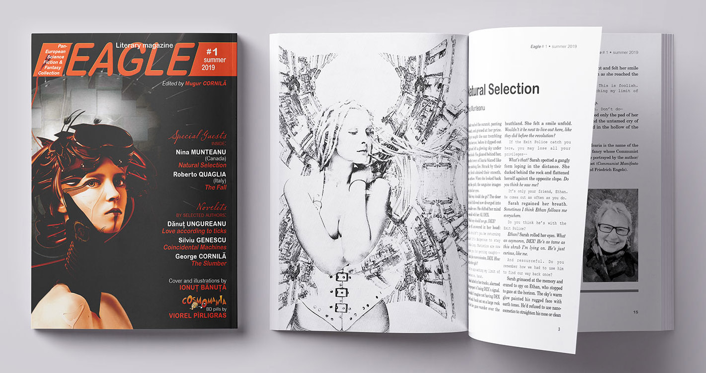
Natural Selection first came out in my short story collection of the same name in 2013. It was then reprinted in the premiere issue of Eagle Magazine and featured stellar and evocative interior illustrations by Ionuț Bănuță.

Interior story art for “Natural Selection”

Out of the Silence first appeared in Issue #85 of subTerrain Magazine in May 2020 and featured diverse and rich interior art and design (not pictured here). Its reprint in A House of Dawn in 2021 received its own artwork, which enhanced the tone and subject of the story.

Cover art for subTerrain Magazine and story art for “Out of the Silence” in A House of Dawn

I’d be remiss if I didn’t add the important artwork of artists on the covers of several of my novels and collections. As a reader, I can attest that cover art plays an important role in introducing a book to a potential reader. Whether we pick up a new author’s book to peruse depends upon the image, title and design of the cover. I have been very fortunate with my publishers and their artists.

Book covers for “Collision with Paradise” and “The Cypol”

My first published novel (Collision with Paradise) and novella (The Cypol)—both SF erotica—were designed to intrigue and titillate.

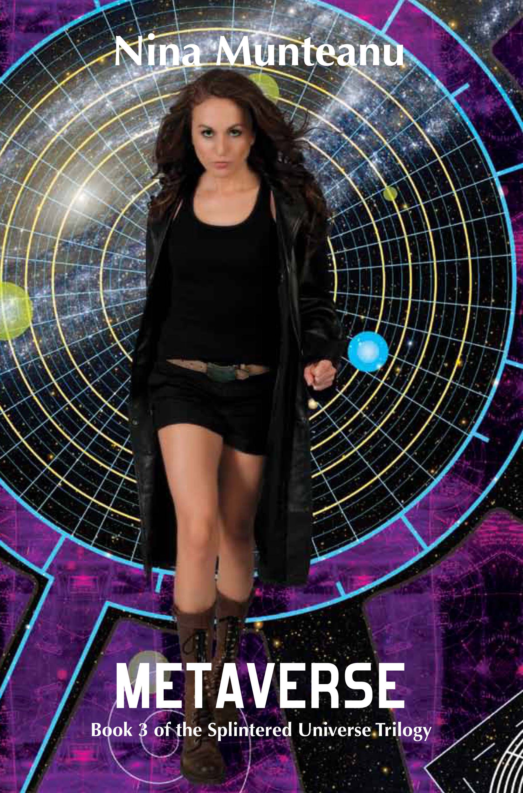
Costi Gurgu illustrated and designed the covers of my space detective thriller The Splintered Universe Trilogy for Starfire. The three books and their covers, formed a tryptic that reflected the journey of the lead character—a badass galactic detective—and her evolution.

Cover art for books of “The Splintered Universe” Trilogy

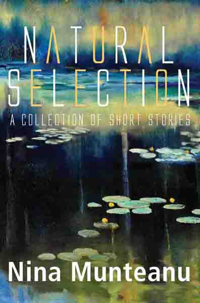
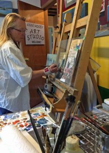
Costi Gurgu also designed the cover of my short story collection Natural Selection for Pixl Press in 2013 using an illustration by West Coast artist Anne Moody that showed the fluidity of nature.

Tikulin-illustrated covers for “Darwin’s Paradox” and “The Last Summoner”

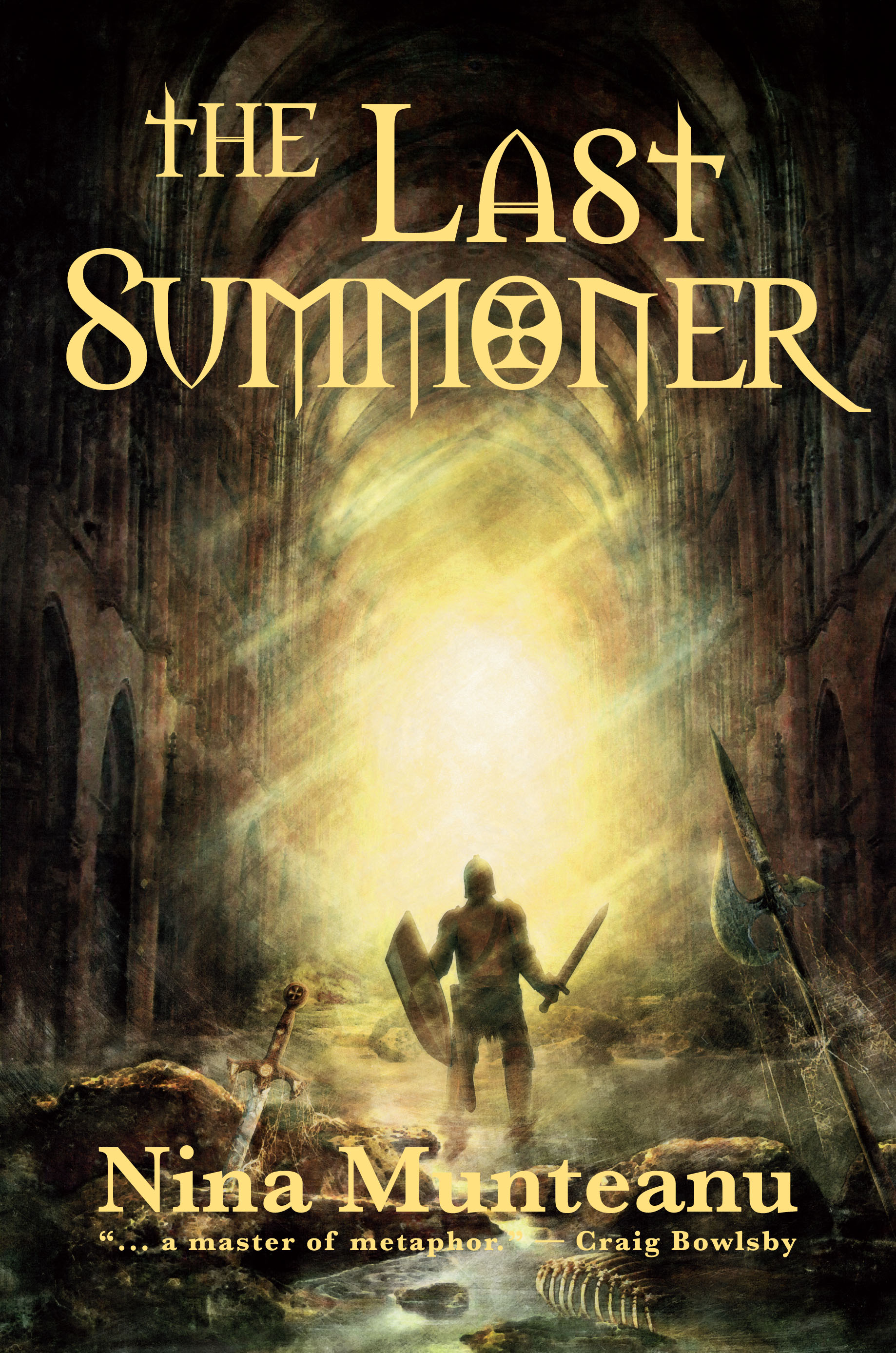
Tomislav Tikulin illustrated the cover of my novel Darwin’s Paradox for Dragon Moon Press in 2007. The cover image ostensibly represented a work of hard science fiction and attracted much attention from SF fans. Tikulin’s evocative illustration of a knight in a drowning cathedral was then used for the cover of The Last Summoner for Starfire, with attractive typology design by Costi Gurgu. As with all of Tikulin’s work, this mysterious cover attracted the attention of many readers with many questions.

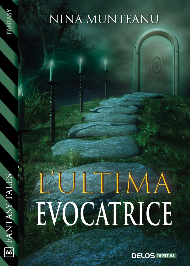
L’Ultima Evocatrice, a novella version of The Last Summoner in Italian was illustrated and designed for Delos Digital Publications in 2021 and draws the reader into the intrigue of the story.

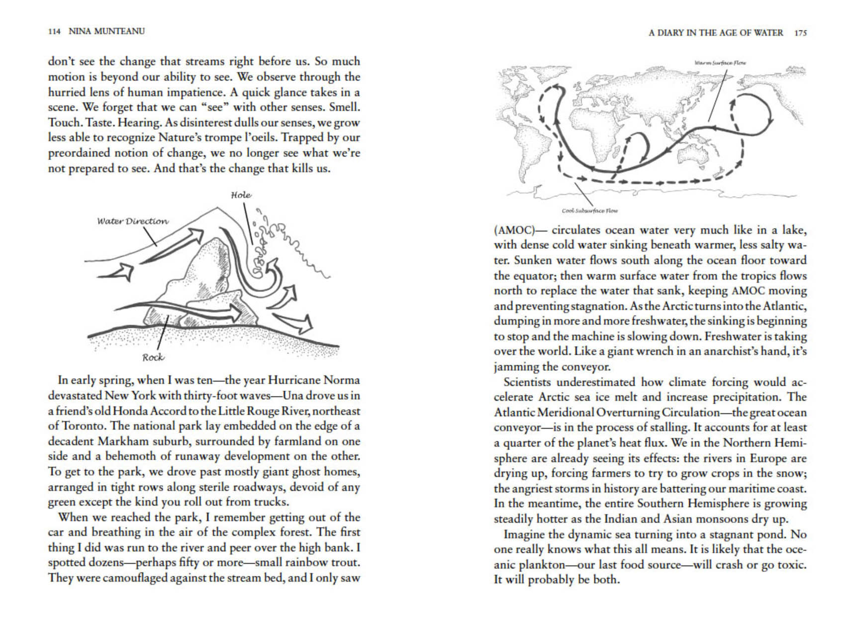
My most recent novel, A Diary in the Age of Water, published by Inanna Publications in 2020, features elegant cover art by Val Fullard and over thirty pieces of interior art work by my own hand.

Interior art representing the diarist’s sketches in “A Diary in the Age of Water

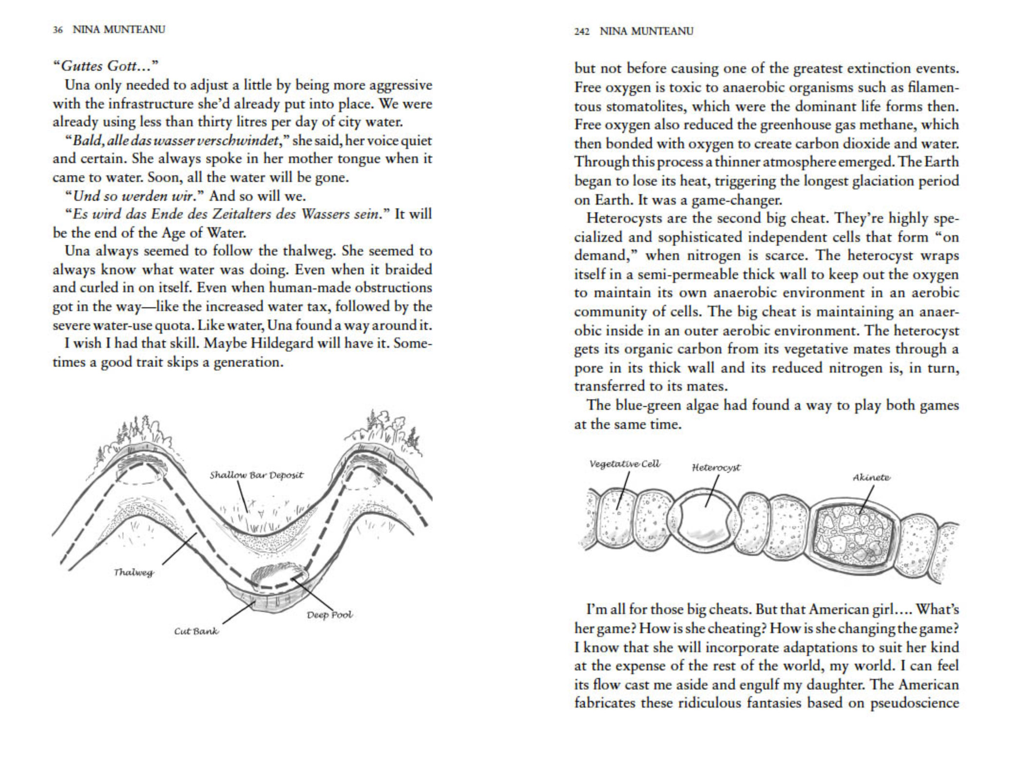
I wasn’t sure if the publisher would agree to use my sketches, but she did, to my surprised delight. She agreed with me that the interior illustrations, which represent sketches by the scientist diarist, lend a tangible reality to the story and a further focus of interest.

Interior art representing the diarist’s sketches in “A Diary in the Age of Water
Interior art representing the diarist’s sketches in “A Diary in the Age of Water”

The excitement never ends for me as a writer … With the newest installation to the Icaria Series imminent, Dragon Moon Press will be re-issuing Darwin’s Paradox and Angel of Chaos, along with the newest addition Gaia’s Revolution along with new covers and interiors. I can’t wait to see what Dragon Moon Press comes up with! …

Cover art of print publications my work has appeared in up to 2021-end

Nina Munteanu is a Canadian ecologist / limnologist and novelist. She is co-editor of Europa SF and currently teaches writing courses at George Brown College and the University of Toronto. Visit www.ninamunteanu.ca for the latest on her books. Nina’s bilingual “La natura dell’acqua / The Way of Water” was published by Mincione Edizioni in Rome. Her non-fiction book “Water Is…” by Pixl Press (Vancouver) was selected by Margaret Atwood in the New York Times ‘Year in Reading’ and was chosen as the 2017 Summer Read by Water Canada. Her novel “A Diary in the Age of Water” was released by Inanna Publications (Toronto) in June 2020.

Artist Costi Gurgu Explains his Cover Art for The Splintered Universe Trilogy

Get Rhea-HawkeGOODWhen I first met Costi and Vali Gurgu at the World Fantasy Convention in Montreal several years ago, I had no idea that Costi would end up creating the stunning book covers for The Splintered Universe Trilogy or that his wife, Vali, would serve as the model for the hero of my story, the relentless and steely detective, Rhea Hawke. You can find his cover art and other artworks on Costi’s illustration site.

Nina: Hi, Costi. Thanks so much for agreeing to do this interview. 

Costi: Hi, Nina. The pleasure is mine.

Nina: You came up with a “Triptych” design for the Splintered Universe Trilogy. What inspired you to come up with it and what do you like about it?

Costi: There is the danger of spoilers in this answer. The fact is that your main character, Rhea, undergoes a certain evolution from a regular human being to… let’s just say something else. And that evolution has three parts, one for each book of the trilogy and it also has a touch of divine. So, the triptych design, so often used for religious paintings, fits like a glove on the entire concept.

Microsoft Word - trilogy-poster03.docx

Nina: Your design for Outer Diverse (and designs for the other two covers) carries a powerful image that conjures a portal or gateway into another world (which is what the trilogy is about). The reader is drawn into an infinite landscape, looking in, and Rhea is looking out. Can you tell us a little about how you conceived this compelling design. Is there a meaning behind the symbols and colours you used? 

Costi: To be honest, the initial idea was for the red ring to be a sort of mapping device and a radar combined into one, since Rhea travels great distances in her quest. Then I realized it might as well be a portal device on top of everything else and serve all her travelling needs.

There were two options —either we would look with her outside, to whatever target she had, or look towards her. I thought that it would be more powerful if we could look towards her and see her determined face, see the unflinching resolution in her eyes, while she’s pondering her next move and readying herself to use the device once again. But to look towards her and see her in a confining room of a space ship, or such, would have defeated the purpose. So I needed to have her against the infinite landscape as the backdrop. She is in a continuous journey to discover herself and this journey takes her literally through the infinite spaces of not just one universe.

BewareRhea-GOOD copy
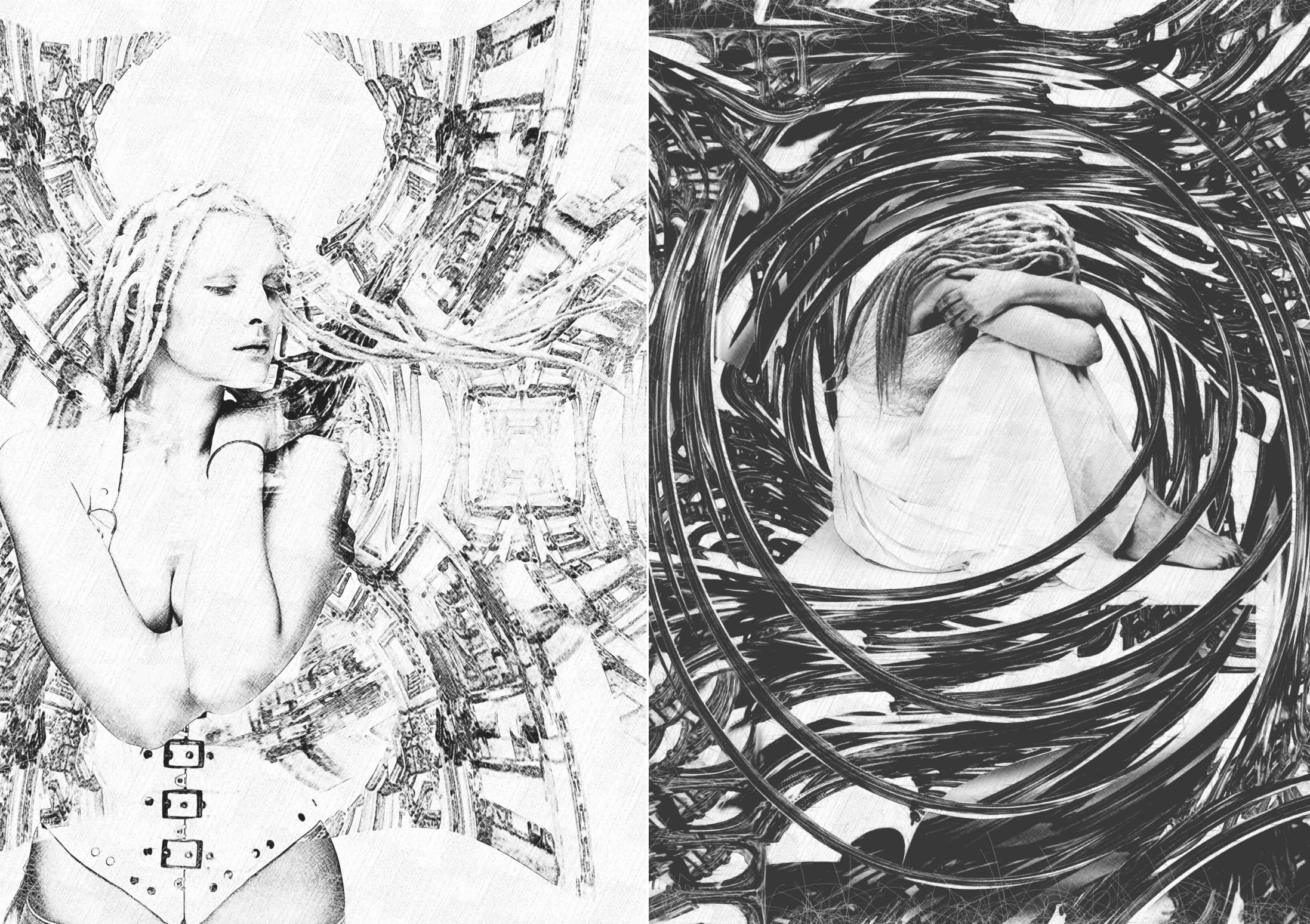
Nina: Yes, I love the metaphoric elements you’ve woven into the design. The image speaks to us on many levels. Do you use music or other devices in your work to evoke your creativity? What other tools did you use to create the stunning covers of Splintered Universe (e.g., animation software, etc.)?

Costi: I’m always listening to music while working. The kind of music varies depending on what I’m working on. If I’m writing for instance, I need instrumental music, without words to influence my own ones. Also, it depends on the kind of feeling and mood I try to generate through my writing or my illustration. Music helps me channel those feelings into the right words or imagery.

Technically speaking, I always start with sketches on paper, which I later scan. I mainly use Adobe Photoshop, but for this illustration I had to use Adobe Illustrator as well. Obviously, the layout and the typography were done in Adobe InDesign.

Nina: Your wife, Vali, was the model for Rhea Hawke. I understand you had a great time doing the photo-shoot (p.s., some of the additional shoots can be seen in the Youtube book trailer). I’ve attended several launches and events and both the cover and the model have been extolled. One reader compared Vali to actress Catherine Zeta Jones. How does Vali feel about being somewhat of a celebrity?

Costi: I’m so happy to hear that. You know, I had to decide how to treat her image. I could have gone towards a more glamorous, shiny look, like in a fashion image, or I could just simply keep it more realistic. Despite Vali’s protests, I chose to keep it that way, because I wanted to offer a realistic image of an ex-police officer: a woman who was used to fighting and chasing criminals, rather than taking care of her appearances. Now, to hear that her rougher and tougher image created that kind of reaction gives me a sort of peace and satisfaction.

Nina: You and Vali have had rich and varied careers in commercial art, law and writing. You’ve served, for instance, as art director for several high-end magazines including Playboy, and you taught graphic design at the college level. You journeyed from Romania to England and finally to Toronto, Canada. No doubt your law degree helped you in your entrepreneurial pursuits. Did you pursue illustration and design in England?

Costi: Well, three years [after England] saw us going back to Romania; our families expected us to go back to the Bar Association and behave responsibly. But after showing my portfolio around I got a designer job at Playboy Magazine! The Art Director and I launched its first Romanian edition issue a few months later. Three years later I became the Creative Director of MediaPro Group, the largest publishing company in Romania and Vali took on the position of Art Director of Playboy Magazine.

Two years later we came to Canada to pursue a dream. So, yes, I could say that my law degree created the perfect opportunity for me to discover my passion for visual arts. It took me to England and eventually to Canada. Life is funny that way.

Nina: Does Vali help you with your work and do you help her with hers?

Costi: We help each other a lot in our work. Because we worked together in our first legal job and after that in our first design job, we have become a team. We have different approaches to the art process and we have different styles. I went deeper into illustration to complement my design skills, while she chose photography to do that.

Even now, for the most important projects we have for our different employers we involve each other not only for need of feedback, but also for need of different ideas and fresh approaches. We basically complement each other.

Not to mention that she’s always my first reader for any piece of fiction I write. She’s the toughest reader I have but in the same time I know she’s also the most sincere one.

Nina: Thanks so much, Costi, for joining us. I wish you the best of luck in all your writing and illustration projects. It’s been an honor to work with you.

Costi: Again, my pleasure, Nina.

Microsoft Word - Rhea Triptych.docx

In Metaverse, the third and last book of The Splintered Universe Trilogy, Detective Rhea Hawke travels back to Earth, hoping to convince an eccentric mystic to help her defend humanity from an impending Vos attack—only to find herself trapped in a deception that promises to change her and her two worlds forever.

You can listen to a sample recording of Outer Diverse, Inner Diverse, and Metaverse through Audible. You can access the complete Splintered Universe Audiobook Trilogy on Audible. Read the Splintered Universe reviews on Goodreads.

audible listen

Microsoft Word - trilogy-poster03.docx

nina-2014aaa

Nina Munteanu is a Canadian ecologist / limnologist and novelist. She is co-editor of Europa SF and currently teaches writing courses at George Brown College and the University of Toronto. Visit www.ninamunteanu.ca for the latest on her books. Nina’s bilingual “La natura dell’acqua / The Way of Water” was published by Mincione Edizioni in Rome. Her non-fiction book “Water Is…” by Pixl Press (Vancouver) was selected by Margaret Atwood in the New York Times ‘Year in Reading’ and was chosen as the 2017 Summer Read by Water Canada. Her novel “A Diary in the Age of Water” will be released by Inanna Publications (Toronto) in 2020.

Amazing Cover Art, Part 2: Anne Moody and Costi Gurgu

MockUpEcology-2

The cover for Nina’s upcoming writing guide: illustration by Anne Moody; typology & design by Costi Gurgu

In my article “Should You Judge a Book by its Cover”, I wrote about the importance of cover art for book sales and to maintain integrity and satisfaction with the story inside. In the article, I pointed out that, “If you don’t know the author of the book, the nature—and implied promise—of the cover becomes even more important. If the book does not deliver on the promise of the cover, it will fail with many readers despite its intrinsic value. A broken promise is still a broken promise. I say cover—not necessarily the back jacket blurb—because the front cover is our first and most potent introduction to the quality of the story inside. How many of us have picked up a book—intrigued by its alluring front cover—read the blurb that seemed to resonate with the title and image, then upon reading our cherished purchase been disillusioned with the story and decided we disliked it and its author?”

Cover art provides an important aspect of writer and publisher branding. Cover artists understand this and address the finer nuances of the type and genre of the story to resonate with the reader and their expectations of story. This includes the image/illustration, typography, and overall design of the cover. A cover for a work of literary fiction will look quite different from a work of fantasy or romance. Within a genre, subtle qualities provide more clues—all of which the cover artist grasps with acute expertise.

I’ve been fortunate in my history as a professional writer to have had exceptional art work on the books I’ve written or collections and anthologies I’ve participated in (see the mosaic below of many but not all the covers my work has been associated with).

For most of my books, my publisher provided me with a direct link to the cover artist (e.g., Dragon Moon Press, Edge Publishing, eXtasy Books, Liquid Silver Books, Starfire, Pixl Press) and I retained some creative control. I even found and brought in the cover artist for projects I had with Pixl Press.

Anne Moody and Pixl Press

Anne-Studio01 copy

Anne Moody working on her next painting

I met Anne Moody at the environmental consulting firm where I worked after leaving the University of Victoria. I’d taught limnology (the study of freshwater) for several years at UVic, then I joined the Vancouver firm as an aquatic ecologist and environmental consultant. That’s where I met fellow ecologist, Anne. Anne is a plant ecologist who has worked with federal and provincial governments on reclamation and restoration projects. She’s designed and planted marshes throughout the world and has taught at university in her field of expertise.

Anne wasn’t painting then. She started long after we parted our ways—she to a government job and I to a teaching job at The University of Toronto. However, as she mentions in her short bio, Anne has been drawing and painting since childhood—just like me. The difference is that she has come back to the fine arts with an eye for compelling imagery. Using her science knowledge and discipline to work with light, texture and form, Anne creates works of stunning originality that resonate with rugged landscape and with those who belong to it. Her work is, needless to say, fetching for a book cover!

FictionWriter-front cover-2nd ed-web copyWhen Pixl Press started looking for suitable cover artists to rebrand my writing craft series, I showed some of Anne’s work to the director Anne Voute. Pixl Press had already worked with Costi Gurgu and we liked his work. The result of Anne’s illustrations and Costi’s typography and design was a series of stunning covers that branded my books with just the right voice.

Journal Writer-FRONT-cover-WEB copy
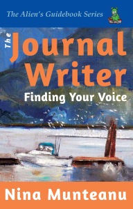
The Alien Guidebook Series, of which two books are out so far (The Fiction Writer: Get Published, Write Now! and The Journal Writer: Finding Your Voice) was designed by Costi with a guidebook brand that would stand out, yet showcase the natural British Columbia landscape art by Anne that I felt strongly connected to. Anne’s cover art for The Journal Writer is one of several studies of Toquart Bay, BC.

FictionWriterCoverWeb copy 2Anne’s illustration for The Fiction Writer (a painting of Knutsford, BC) actually represents the second cover. The Fiction Writer was originally released in May 2009 and the cover portrayed a spiral galaxy—beautifully designed by Virginia O’Dine. The cover overly stressed my science fiction background and did not give a balanced portrayal of the guidebook, which addresses any fiction—not just science fiction. Anne’s portrayal of a field in Knutsford was deemed better suited to a new branding for the series.

MockUpEcology-2I am currently researching and writing the third guidebook in the series—a reference on world building and use of ecology in story—The Ecology of Story: World as Character.

I visited Anne at her ranch near Vanderhoof, B.C., to discuss a cover. Between chores on the 100-acre ranch, gourmet meals from local produce, and lively political discussions over generous amounts of wine—we spent the entire weekend looking over and evaluating Anne’s pieces as potential cover art. Anne had so many good pieces, I became confused with what would work best.

Nina-sedgefield at Annes-closest2 copy 2

Nina stands in Anne’s sedge marsh

Finally on the last day, we stumbled on the perfect one: a painting Anne had done of a photograph her daughter had taken during a wildfire in northern British Columbia. Anne had stylized the photo into its own narrative that was compelling. My publisher was excited by it. We expect Pixl Press to release The Ecology of Story in late 2019.

NaturalSelection-front-web copyAnne’s art work for the cover of Natural Selection: A collection of short stories had originally resonated with me when she had first shown me the original painting at an art show on Vancouver Island. Called Mere Tranquility, her acrylic and oil painting uses shades of aqua, green, blue and yellow to convey a small pond during a quiet summer day. She’d captured the elusive dance of light and water perfectly. I was reminded of the genius of Monet. Anne was delighted to let us use it. Pixl Press commissioned Gurgu to design the cover; his minimalist clean design was pure genius.

The cover for Natural Selection remains one of my favourite covers of all time. And it just so happens that the cover art and design solidly portray the tone and content of the stories within. Bellisima!


anne-moody-plein-air-painting

Anne Moody painting en plein-air

Anne Moody is a celebrated Canadian artist and plant ecologist. She worked with the British Columbia provincial government in their Department of Environment and now consults for her own company. She has been drawing and painting since childhood and won her first award at a “Painting in the Parks Program” when she was nine.

“I consider myself a realist, strongly tempted by abstract elements wrapped in story,” says Anne. “The images that speak to me are scenes that convey meaning beyond superficial beauty. My compulsion to paint takes charge when an image embedded in my memory will not allow me to rest until I promote it to canvas. My choice of medium, water-colour, acrylics or oil, is dictated by the nature of the image.”

All Nina Munteanu books can be found on most Amazon sites.

Microsoft Word - Publication-COVERS-all-2018.docx

nina-2014aaaNina Munteanu is an ecologist and internationally published author of award-nominated speculative novels, short stories and non-fiction. She is co-editor of Europa SF and currently teaches writing courses at George Brown College and the University of Toronto. Visit www.ninamunteanu.ca for the latest on her books. Nina’s recent book is the bilingual “La natura dell’acqua / The Way of Water” (Mincione Edizioni, Rome). Her latest “Water Is…” is currently an Amazon Bestseller and NY Times ‘year in reading’ choice of Margaret Atwood.

Amazing Cover Art, Part 1: Tomislav Tikulin and Costi Gurgu

In my article “Should You Judge a Book by its Cover”, I wrote about the importance of cover art for book sales and to maintain integrity and satisfaction with the story inside. In the article, I pointed out that, “If you don’t know the author of the book, the nature—and implied promise—of the cover becomes even more important. If the book does not deliver on the promise of the cover, it will fail with many readers despite its intrinsic value. A broken promise is still a broken promise. I say cover—not necessarily the back jacket blurb—because the front cover is our first and most potent introduction to the quality of the story inside. How many of us have picked up a book, intrigued by its alluring front cover, read the blurb that seemed to resonate with the title and image, then upon reading our cherished purchase been disillusioned with the story and decided we disliked it and its author?”

Collision With Paradise Small

Liquid Silver’s romance / SF cover

Cover art provides an important aspect of writer and publisher branding. Cover artists understand this and address the finer nuances of the type and genre of the story to resonate with the reader and their expectations of story. This includes the image/illustration, typology, and overall design of the cover. A cover for a work of literary fiction will look quite different from a work of fantasy or romance. Within a genre, subtle qualities provide more clues—all of which the cover artist grasps with expertise.

I’ve been fortunate in my history as a professional writer to have had exceptional art work on the books I’ve written or collections and anthologies I’ve participated in (see the mosaic below of many but not all the covers my work has been associated with).

For most of my books, my publisher provided me with a direct link to the cover artist (e.g., Dragon Moon Press, Edge Publishing, eXtasy Books, Liquid Silver Books, Starfire, Pixl Press) and I retained some creative control. I even found and brought in the cover artist for two projects I had with Starfire.


Tomislav Tikulin and “The Last Summoner

DarwinsParadox-Cover-FINALsmall

Dragon Moon’s SF cover

Croation artist Tomislav Tikulin was the artist my Dragon Moon publisher had found for my 2007 book “Darwin’s Paradox”. For Darwin, I worked closely with Tikulin, who created the compelling hard science fiction cover of “future Toronto” that has attracted readers to the book for years. Tikulin has done cover designs for many publishers and bestselling writers from Ray Bradbury’s Dandelion Wine and Arthur C. Clarke’s Rendezvous with Rama to Amazing Stories Magazine.

Cover1_LastSummoner-frontcover

Starfire’s fantasy cover

In perusing Tikulin’s website one day, I was transported by one of his illustrations—of an awestruck knight standing knee deep in a mire within a huge drowned cathedral. Shafts of golden light from the vaulted ceiling angled across, bathing the mire and the bemused knight beneath. There was a powerful story in that image, I thought, and wrote a whole book based on it: “The Last Summoner”. Imagine the feeling when I approached Tikulin to licence the image and then my Starfire publisher to use it—and both agreed! You’ll have to read the book to find out why the image was so important to the overall story. Graphic artist Costi Gurgu took Tikulin’s image and used his typology and design skills to create an extraordinary front and back cover and spine. You can learn more about Tikulin in my interview with him on The Alien Next Door.


Costi Gurgu and “The Splintered Universe Trilogy

Front Cover ONLY-web

Starfire’s SF cover

I met Costi Gurgu and his wife Vali Gurgu at a science fiction convention in Montreal in 2009. Costi and Vali were successful graphic artists working on magazine covers and interiors for top magazines in Toronto. When I eventually moved there to teach at the University of Toronto, I discussed cover design with Costi. I was working on a detective thriller in space with kick-ass female detective and Galactic Guardian, Rhea Hawke. I’d initially envisioned the book as one entire novel with three parts, but it very soon became apparent to me that it was three actual books in a trilogy. The Splintered Universe Trilogy consists of Outer Diverse, Inner Diverse, and Metaverse.

I was intrigued by what Costi designed: a “Triptych” for the three books of The Splintered Universe Trilogy. In an interview I did on The Alien Next Door, I asked him what inspired him to come up with it and what did he like about it? Costi replied:

“Your main character, Rhea, undergoes a certain evolution from a regular human being to… let’s just say something else. And that evolution has three parts, one for each book of the trilogy and it also has a touch of divine. So, the triptych design, so often used for religious paintings, fits like a glove on the entire concept.”

Inner-diverse-front-cover-WEB

Starfire’s SF cover

I was very taken by how the design for the triptych carried a powerful image that conjures a portal or gateway into another world (which is what the trilogy is about). The reader is drawn into an infinite landscape, looking in, and Rhea is looking out from within in Outer Diverse, bursting through in Inner Diverse, and walking outside with confidence in Metaverse. Costi explained the meaning behind the symbols and colours he used: “The initial idea was for the red ring to be a sort of mapping device and a radar combined into one, since Rhea travels great distances in her quest. Then I realized it might as well be a portal device on top of everything else and serve all her travelling needs.

There were two options —either we would look with her outside, to whatever target she had, or look towards her. I thought that it would be more powerful if we could look towards her and see her determined face, see the unflinching resolution in her eyes, while she’s pondering her next move and readying herself to use the device once again. But to look towards her and see her in a confining room of a space ship, or such, would have defeated the purpose. So, I needed to have her against the infinite landscape as the backdrop. She is in a continuous journey to discover herself and this journey takes her literally through the infinite spaces of not just one universe.”

Costi also shared some of the process in creating a cover design:

Metaverse-FRONT-web

Starfire’s SF cover

“Technically speaking, I always start with sketches on paper, which I later scan. I mainly use Adobe Photoshop, but for this illustration I had to use Adobe Illustrator as well. Obviously, the layout and the typography were done in Adobe InDesign.”

Costi’s wife, Vali, was the model for Rhea Hawke. Some of the additional shoots can be seen in the Youtube book trailer). Costi shared that, “I had to decide how to treat her image. I could have gone towards a more glamorous, shiny look, like in a fashion image, or I could just simply keep it more realistic… I chose to keep it that way, because I wanted to offer a realistic image of an ex-police officer: a woman who was used to fighting and chasing criminals, rather than taking care of her appearance.”

You can read the complete interview with Costi on The Alien Next Door.

All Nina Munteanu books can be found on most Amazon sites.

Microsoft Word - Publication-COVERS-all-2017.docx

Sampling of publication cover art for works by Nina Munteanu (to 2017)

nina-2014aaaNina Munteanu is an ecologist and internationally published author of award-nominated speculative novels, short stories and non-fiction. She is co-editor of Europa SF and currently teaches writing courses at George Brown College and the University of Toronto. Visit www.ninamunteanu.ca for the latest on her books. Nina’s recent book is the bilingual “La natura dell’acqua / The Way of Water” (Mincione Edizioni, Rome). Her latest “Water Is…” is currently an Amazon Bestseller and NY Times ‘year in reading’ choice of Margaret Atwood.